Packaging
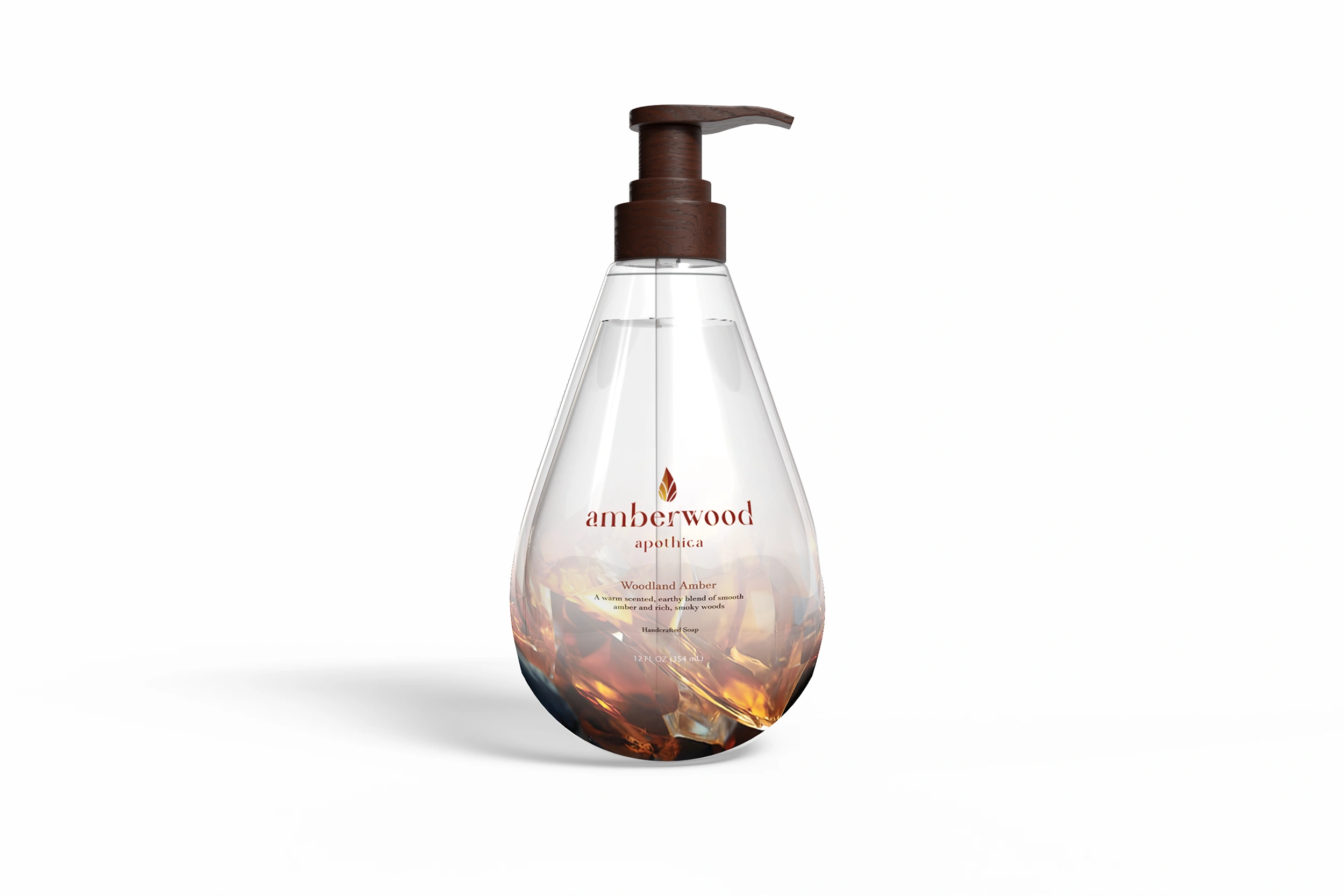
Amberwood Apothica
An amber-inspired identity expressed through bottle design, typography, and labels.
The project
Amberwood Apothica connects a refined wordmark with a sculptural pump-bottle concept. The project includes brand artwork, product presentations, and the flat labels that support the bottle design.
Design direction
Warm amber imagery informs the product presentation, while the serif wordmark supplies a quieter counterpoint. Front, back, and base label studies show the identity translated into practical packaging surfaces.
Scope of work
- Brand mark and typography
- Bottle concept
- Label artwork
- Product mockups
A closer look
08 imagesNext project
Spikebirds — Angry Birds × Spikeball
View project